Walk into almost any modern workplace, and you’ll see glass used to shape the space without making it feel boxed in — whether that’s through a sleek glass partition, a meeting room wall, or a full-height divider. But “glass” isn’t one decision. The finish you choose changes how private a room feels, how bright it stays through the day, how distracting reflections become, and even how confidently people move around the space.
If you’re planning changes for a Central Coast office, studio, clinic, or education setting, you’ll usually be choosing between three broad looks:
• Clear glass for maximum openness
• Frosted (or translucent) finishes for softer privacy
• Tinted glass for glare control and a more muted, premium feel
This guide helps you pick the right level of openness, room by room, using a simple “privacy spectrum” approach and a few practical checks that stop the most common fit-out regrets.
Start with the privacy spectrum (not the product)
A helpful way to choose is to picture privacy as a spectrum rather than a yes/no switch.
Level 1: Fully open
Clear glass gives you maximum transparency and daylight sharing. It’s great when the goal is visibility, supervision, collaboration, or simply making a space feel bigger.
Where it shines:
• Reception-to-workspace visibility (welcoming, airy)
• Corridors where wayfinding matters
• Spaces that feel cramped without borrowed light
Where it can backfire:
• Meeting rooms that feel like a fishbowl
• Private offices where screens are visible to passers-by
• Any place where people need psychological privacy to focus
Level 2: Soft privacy (still bright)
Frosted finishes and translucent patterns reduce direct line-of-sight while still letting light through. This is the “privacy without darkness” zone.
Where it shines:
• Meeting rooms where people want to talk freely
• Treatment/consult rooms where dignity matters
• Quiet rooms and focus zones
Where it can backfire:
• If you frost too much, spaces can feel clinical or disconnected
• Some frosting still shows silhouettes, especially at night
Level 3: Controlled openness (muted, calmer)
Tinted glass reduces glare and can make spaces feel calmer and more premium. It also adds a layer of visual separation.
Where it shines:
• Bright, sunlit areas where reflections are distracting
• Spaces with lots of screens (design studios, admin hubs)
• Boardrooms where you want a more “contained” feel
Where it can backfire:
• In already-dim interiors, tint can make rooms feel flat
• It can hide facial cues, which matters for collaboration and accessibility
Clear glass: what you gain (and what you risk)
Clear glass is the default because it feels modern and “open plan without the noise.” It shares daylight beautifully, helps teams feel connected, and makes smaller footprints feel less cramped.
The trade-offs are mostly about comfort:
• Visual distractions: movement in corridors and adjacent desks can pull attention away
• Screen visibility: even if the room is “private,” people can still see what’s on the monitors
• Meeting room anxiety: people often behave differently when they feel watched
Best uses for clear glass indoors
• Internal windows (borrowing light without creating a doorway)
• Reception screens that preserve visibility
• Collaboration areas where transparency is part of the culture
Common mistake: clear glass everywhere
When everything is clear, your “open” design can turn into a workplace where no one feels comfortable taking a call, having a feedback conversation, or focusing deeply.
Frosted glass: privacy without feeling shut in
“Frosted” can mean different things:
• Frosted glass (a permanent translucent finish in the glass itself)
• Frosted film (an applied layer that creates a similar look)
• Patterns, gradients, or bands (targeting privacy where you need it)
In most workplaces, frosting is used to control sightlines at standing and seated height while keeping the room bright.
What frosting does well
• Stops the fishbowl feeling in meeting rooms
• Creates discretion in clinics and consult spaces
• Keeps daylight moving through the floorplate
• Adds visual interest (especially with subtle patterns or gradients)
What frosting does not do
It doesn’t “soundproof” a room. If acoustics matter, you’ll need to think separately about door seals, ceiling treatments, and room placement. Visual privacy and acoustic privacy are different problems.
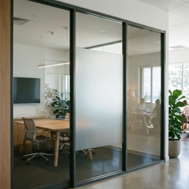
Gradient frosting: the underused sweet spot
A gradient (clear at the top, frosted through the middle, clear or lighter below) can be a great compromise:
• Maintains daylight and connection above eye level
• Protects privacy at standing height
• Keeps the space feeling less “walled off”
It’s especially useful in meeting rooms facing shared corridors, where you want discretion without making the hallway feel closed.
Tinted glass: glare control and a calmer, premium look
Tinted glass is often chosen for mood and comfort as much as privacy. It can reduce harsh brightness and reflections, particularly in spaces with strong daylight.
On the Central Coast, high ambient light and reflective conditions (bright skies, light-coloured paving, coastal glare) can make screen glare and reflections a real comfort issue—especially when an office layout can’t be perfectly oriented.
Where tint helps most
• Screen-heavy rooms (design, finance, admin)
• Meeting rooms with video calls (reducing harsh reflections)
• Spaces where you want a more “contained” atmosphere
The big caution with tint indoors
Tint reduces light. If the space is already internal or relies on borrowed light, you can unintentionally create a darker, less energetic environment. This is where a site-specific daylight check matters (even a simple walk-through at different times of day can reveal a lot).
Frosted glass vs frosted film: what’s the difference?
This is a common decision point because both can look similar at a glance.
Frosted film (applied)
Pros:
• Quick to apply
• Easy to change later (rebrand, layout change)
• Can do patterns, gradients, bands, and logos cleanly
• Useful for trialling privacy zones before committing
Cons:
• Can show seams if not installed well
• Edges can lift in high-wear or cleaning-heavy areas
• Some films scratch or scuff over time
Frosted glass (in the glass itself)
Pros:
• Durable finish that won’t peel
• Consistent look with fewer “film” cues
• Can feel more premium depending on the finish
Cons:
• Harder to change if you alter the layout later
• Replacement is more involved than swapping a film
A practical rule: if you think your space will change (teams growing, rooms being re-zoned, brand refreshes), film can offer flexibility. If the layout is stable and the finish is part of a long-term design, permanent frosting can make sense.
Choose by room type: a practical guide
Instead of deciding globally, decide room by room. Here’s a simple approach that keeps the whole workplace feeling open while giving privacy where it matters.
Meeting rooms
What people need:
• Comfort speaking freely
• Fewer distractions from the corridor
• Camera-friendly lighting for video calls
Often works well:
• Frosted bands or gradients at eye level
• Clear above for daylight and connection
• Consider tint only if glare is a known problem
Ask yourself:
• Can passers-by see faces and whiteboards?
• Does the room face a busy corridor?
• Is there strong reflected light onto screens?
If you’re comparing finishes side-by-side, start with your office glass finish options and map them to how the room is actually used day to day.
Private offices
What people need:
• Focus and reduced visual distraction
• Screen privacy
• A sense of “ownership” without complete isolation
Often works well:
• Partial frosting (seated-height privacy)
• Clear upper sections for daylight
• Tint can work for screen-heavy roles if the room has enough natural light
Common mistake:
• Going fully clear and then trying to “fix” the discomfort with blinds (which can look cluttered and reduce openness).
Reception and client-facing areas
What people need:
• Warmth and clarity
• Easy wayfinding
• Brand-aligned first impressions
Often works well:
• Mostly clear with targeted frosting where privacy is needed (e.g., admin desks, storage sightlines)
• Subtle patterns that reinforce the brand without making the space feel closed
Clinics, consult rooms, allied health, and wellbeing spaces
What people need:
• Dignity and discretion
• Calm lighting
• Clear “private” cues
Often works well:
• Frosted finishes with stronger obscurity
• Patterning that prevents silhouettes in sensitive zones
• Careful thought about after-dark lighting differences
Corridors and high-traffic areas
What people need:
• Safety and visibility
• Reduced collision risk
• Comfortable movement and navigation
Often works well:
• Clear glass with visible markings or frosting bands
• Avoid fully clear, unmarked panels in busy walkways
Safety and compliance: don’t skip “human impact” considerations
Interior glass isn’t just a design choice. In many settings, it has safety requirements—especially where people can walk into it, fall into it, or collide with it.
A reliable starting point for understanding safety intent is the NCC guidance on glazing and human impact, which outlines where safety glazing is typically required and why. See the NCC section on glazing and human impact here: NCC 2022 glazing and human impact.
What this means in practical terms for a fit-out:
• Glass in doors and adjacent panels often needs particular attention
• Large clear panels in walkways should be made visible (markings/bands/manifestations)
• The safer choice is to plan visibility intentionally, not as an afterthought
Q&A: Do frosting bands count as visibility markings?
They can—if they’re placed where people naturally look and at heights that reduce collision risk. But visibility is about real-world behaviour, not just aesthetics. The goal is that someone walking briskly, carrying items, or distracted by conversation can still perceive the barrier.
Light, glare, and reflections: the “screen test” you should do
If you want one simple, high-value check before choosing finishes, do this:
• Stand where the desks or meeting tables will be
• Hold your phone or laptop at a typical angle
• Look for reflections from windows, bright walls, and overhead lighting
• Walk past the proposed glass line and see what catches your eye
Why it matters:
• Clear glass can create reflections that feel like “visual noise”
• Tint can help, but can also dim the room
• Frosting can diffuse light, sometimes improving comfort
On bright Central Coast days, glare can be an everyday issue, not a rare event. A finish that looks great on an overcast morning can feel very different at 2pm in summer.
Maintenance and cleaning: what looks good after six months?
Design choices should survive real life: fingerprints, cleaning routines, and high-touch areas.
Clear glass
• Shows fingerprints and smears easily
• Easy to inspect and clean, but you’ll clean it more often
Frosted finishes
• Hide fingerprints better, but can trap oils depending on the finish
• Some patterns show uneven cleaning if products aren’t compatible
• Films can scratch if abrasive pads are used
Tinted glass
• Can mask some smears, but reflections may highlight streaks
• Needs good cleaning technique to avoid visible wipe patterns in strong light
A quick decision checklist you can use today
Use this before you commit to a finish.
Step 1: Define the room’s “privacy job”
Pick the main job:
• Make people feel comfortable speaking
• Hide screens and sensitive information
• Reduce distractions
• Improve glare and reflections
• Keep a space bright and open
Step 2: Map sightlines
• From corridor to meeting table
• From reception to staff zones
• From shared desk areas to private offices
Step 3: Choose your openness level
• Clear: maximum openness
• Frosted: privacy at eye level
• Tinted: calmer mood and reduced glare (if light levels allow)
Step 4: Add visibility and safety thinking early
Especially in walkways and doors, plan how the glass will be perceived so it’s not “invisible.”
If you’re planning layouts that rely on transparency, it helps to think through glass partitions for modern workspaces as a broader system—light, privacy, movement, and safety—rather than one-off panels.
Common mistakes (and how to avoid them)
Mistake 1: Choosing based on the showroom look only
A finish can look perfect in a controlled environment and feel wrong once it’s exposed to your lighting, your traffic flow, and your daily habits.
Fix:
• Do a daylight + glare check at different times
• Test sightlines from real positions (seated and standing)
Mistake 2: Over-frosting and losing connection
Too much frosting can make the workplace feel fragmented, even if it solves privacy.
Fix:
• Use bands or gradients
• Keep clear upper sections where possible
Mistake 3: Expecting visual privacy to solve noise
Frosting changes what you see, not what you hear.
Fix:
• Consider room placement (away from noisy zones)
• Think about seals, ceilings, and soft finishes elsewhere
Mistake 4: Forgetting after-dark behaviour
Silhouettes and visibility can change when internal lights are on and outside areas are darker.
Fix:
• Consider evening conditions if the business runs late
• Choose obscurity levels accordingly
Mistake 5: Ignoring visibility markings in high-traffic areas
Unmarked clear glass is a classic collision risk.
Fix:
• Build visibility into the design with bands, patterns, or manifestations that suit the aesthetic
Putting it all together: a simple “best fit” guide
If you want the shortest path to a confident choice:
• Choose clear when visibility, openness, and shared daylight are the priority—and the room doesn’t require discretion.
• Choose frosted when you want privacy without closing the space—especially for meeting rooms, consult rooms, and focus areas.
• Choose tinted when glare and reflections are the real pain points and the space has enough light to remain comfortable.
And remember: you don’t have to pick just one. Many of the best interiors combine them so the workplace feels open overall, with privacy where people actually need it.
If your goal is a refined look that balances privacy and light, it’s worth exploring how finishes work alongside layout planning and safety considerations, especially when you’re aiming for premium glass partitions for offices.
FAQ
Does frosted glass reduce natural light?
Frosted finishes still let light through, but they diffuse it. The room usually stays bright, though the light can feel softer and less direct.
Is tinted glass a good idea for small offices?
It can be, but only if the space already has plenty of light. In dim interiors, tint can make the room feel smaller or flatter. A quick daylight check helps avoid regret.
Can I combine clear and frosted in the same room?
Yes, and it’s often the best approach. Clear sections preserve openness and borrowed light, while frosting at eye level provides privacy.
Is frosted film “cheap looking”?
Not necessarily. High-quality film with clean edges and a well-chosen pattern can look very polished. The key is matching the finish to the space and ensuring it’s installed neatly.